
 The back cover is a plain background with the typography linked with the front cover and the back cover is simple. On the bottom we can also see the institutional information at the bottom along with the bar code. We can also see the logo for the record company and the websites. By looking at the codes and conventions we were able to adhere to them as well as making them our own by changing where we place them for example our bar code is at the top of our back cover. When looking at our ancillary tasks we have kept our brand identity as we used the typography and font colour consistent as well as the images. For our ancillary tasks we had used bright colours to attract our target audience and catch people's eyes. We had subverted using pastel colours like traditional images. By subverting the codes and conventions we have made the ancillary tasks original. We have have also made it have visually appealing aesthetics so that people would take a look at it and buy it. When looking at the back cover, we have kept the typography and colour consistent. We have also stuck to conventions by keeping a main image of the artist on the back cover. We have also stuck to conventions by keeping the institutional information and having a bar code. We have also taken into account what sides the track lists and what sides to put it on we have gone for the right hand side without numbers. We have also added the artists' name to make it stand out and making it bold so it can stand out. We have also kept the colour consistent once again by using hot pink, light blue and black. We have also made sure that by conforming to conventions of a back cover we needed to make it our own and original and we felt that e have done this. By looking at The Saturday's album we see they have kept their back cover simplistic and we have done this as well. They had linked their typography on the front cover and the back like ours and just kept the basics of a back cover such as the institutional information, including websites and logo's along with the bar code. Overall I have felt that our ancillary text's are creative and original.
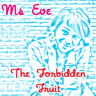


No comments:
Post a Comment